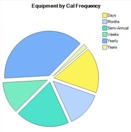
Dashboard Charts
Under the Calibration tab in the Visual group, you'll find a new Dashboard including Column charts, Pie charts and more. You can change the look and feel of the dashboard by customizing each chart.
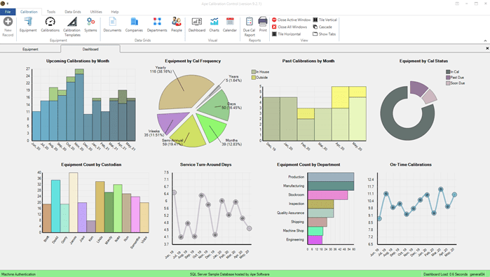
Refresh the Dashboard and the randomized chart colors by right-clicking a grey area and clicking Refresh. Additionally, you have Options to modify the alignment and spacing of the charts.
Edit Dashboard Charts
To edit each chart, double click the chart or right-click and select Edit.
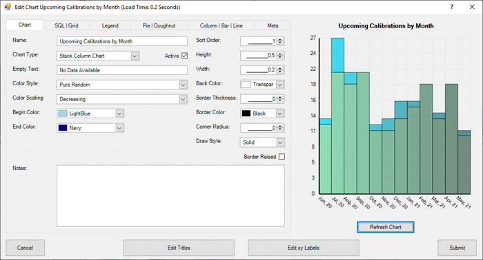
Chart tab
If you want to remove a chart from the Dashboard, deselect the Active checkbox. You can also edit all Dashboard Charts in the Tools tab of Calibration Control.
Sort Order determines the order of the charts in the Dashboard.
Height and Width: The default height of 0.5 refers to 50% and the Width of 0.2 is 20%. Any number above 0.9 is in pixels.
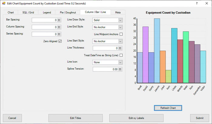
Click the Refresh Chart button to see the reflected changes while editing.
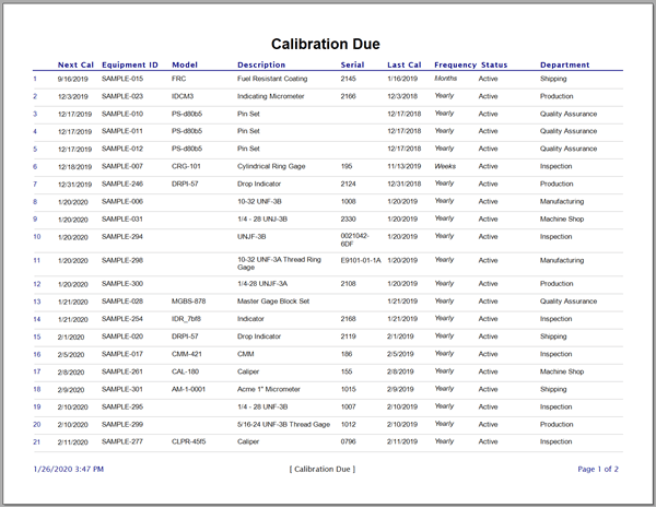
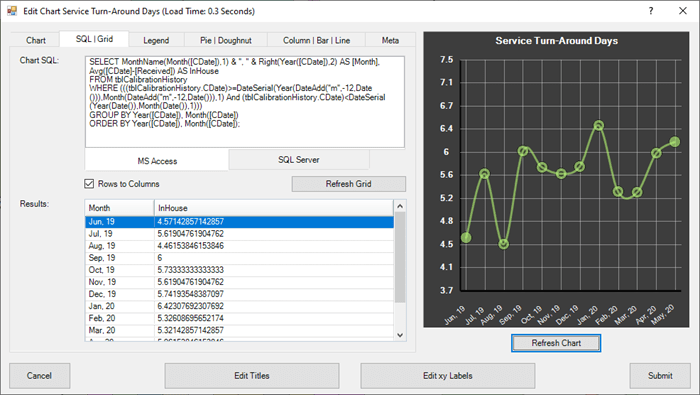
SQL| Grid tab
Whether you are using a MS Access or SQL Server database, the SQL for the appropriate database type will be automatically selected. The SQL script produces the chart data and you can view the Results in grid format by clicking Refresh Grid.
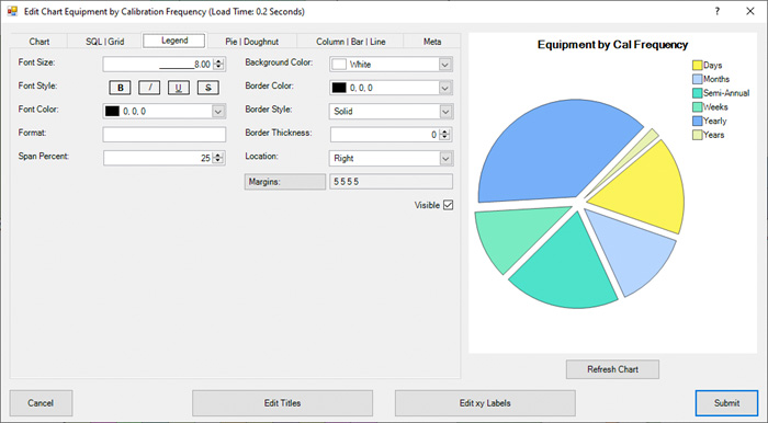
Legend tab
First, make the Legend visible by checking the Visible checkbox and Refreshing the Chart. Then, you can use the available settings to modify the legend.
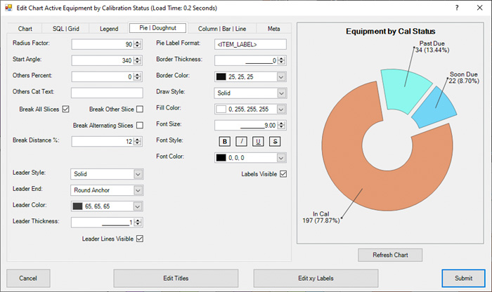
Pie | Doughnut tab
If you are editing a Pie or Doughnut chart, use these available settings to modify the chart.
Column | Bar | Line tab
Column or Bar spacing settings are located on the left. Settings for Line or Spline charts are located on the right.
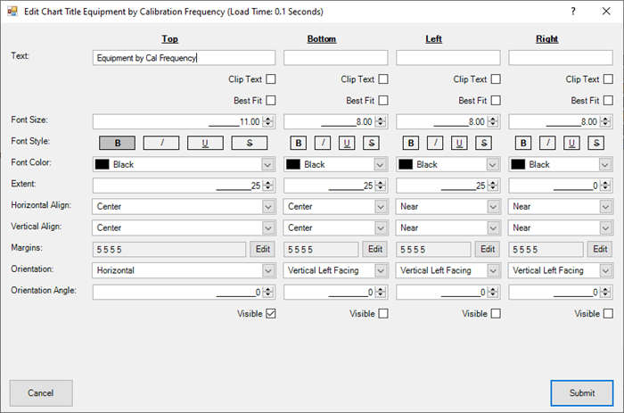
Edit Titles
By default, all charts have a Top title already visible. You can edit each available title in this dialog but only the titles marked as Visible will appear on the chart.
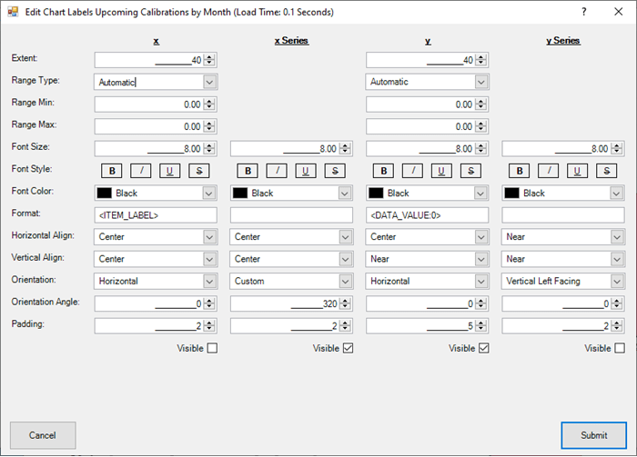
Edit XY Titles
You can edit XY chart titles here. The Visible titles depend on the type of chart you are editing. For example, Stack Column charts use X and Y titles.